Make the offer clear, give the system enough range to grow, and leave people with a feeling they can name.
Make the offer legible
A guest should understand the point of view before they have to decode the menu.
Give the system range
A useful identity should hold a storefront, a cup, a bowl, and the next idea.
Leave a memory
Recognition is the start. The details are what make a brand worth returning to.
Memento Tea and Noodles
Tea and spice, in one clear world.
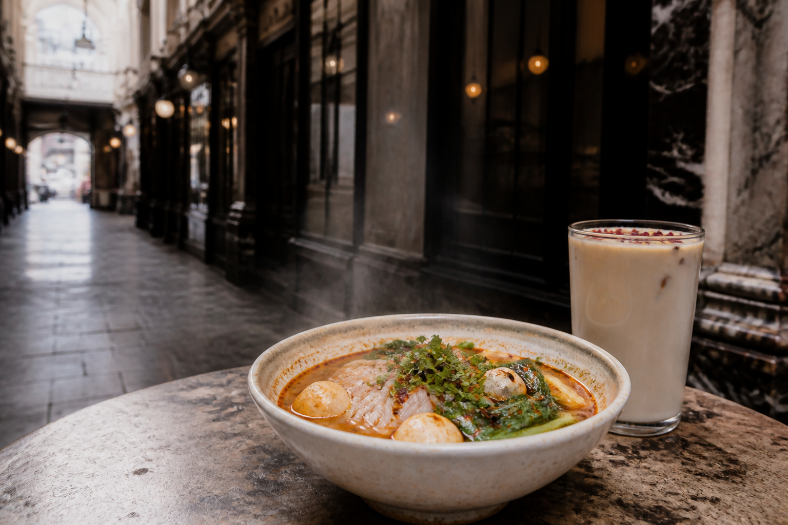
Memento brings together the comforting aroma of milk tea and the fiery spirit of malatang at 21 Thornton's Arcade in Leeds.
Visual direction for the story
The opportunity
Memento had two strong signals to hold together: a tea menu with floral detail, and a noodle experience built around heat, choice, and the energy of Chinese street culture.
The point of view
The brand works best when the contrast is visible. Cool arcade stone, dark storefronts, warm chili, and the softer language of tea give the menu a world that feels both focused and open.
The experience
From premium jasmine milk tea and white champaca to rice noodles, hot and sour bowls, and self-selected combinations, the range feels like one invitation rather than separate categories.
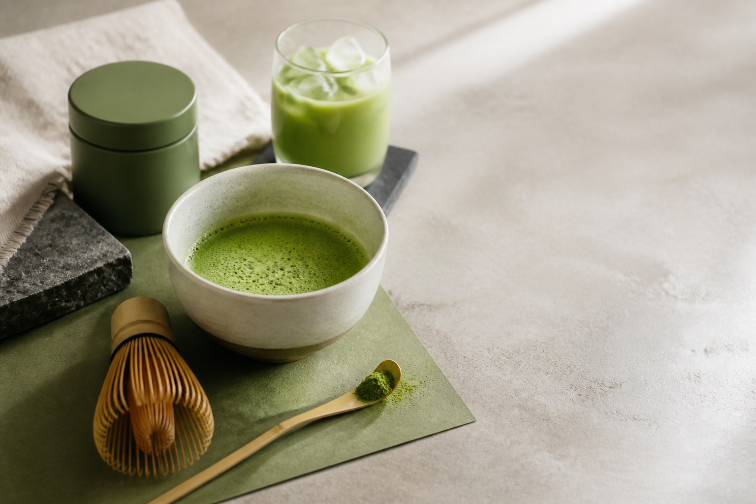
M+ Matcha sits between Japanese source, specialty drink culture, and the everyday ritual of making a better cup at home.
Visual direction for the story
The opportunity
Matcha can look beautiful and still feel difficult to understand. The work is to make provenance, taste, and preparation feel immediate without flattening the ritual.
The point of view
A restrained green, tactile materials, and a calm rhythm create space for the product to speak. The identity feels considered, but never distant from daily use.
The experience
A flexible system can move from a barista blend and a premium tin to recipes, workshops, and café partnerships. Every touchpoint keeps the same promise: better matcha, made easier to choose and enjoy.